
A strong brand identity doesn’t mean just picking up a few colors and slap them together with a logo. You have to approach your design strategically. This requires deep thinking, a team with strong communication and design skills, and a deep understanding of your brand.
With the right direction, you can produce a great brand identity. In this Monday Learning lesson, we will outline the 5 most important steps in the process of designing a brand identity.
What is a brand identity?
“A brand identity is a way to communicate with the world, differentiate yourself from your competition, and create a brand experience that encourages people to engage with you.” Your brand identity design is what shapes your company. To start developing a strong brand identity first you need to know who you are. Answer the most basic questions about your company like what’s your “why?”. Who are your values and what beliefs drive your company? What is your brand personality – if your brand was a person, what kind of personality would have: happy, professional, or? What is your uniqueness – How do you differentiate yourself from the competition? Most importantly, what’s your brand voice? When you’ll have the answers to those questions you can start brainstorming, researching, and generating ideas about the visuals of the brand.
Design is the foundation of your brand. Strong brand identity includes awesome logo, colors, typography, photography and design guide.
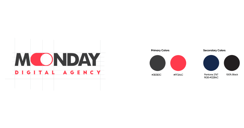
Logo
Your brand designs start from the logo. Take the pencil and start shaping your ideas. Flesh out logo mark, core shapes, and complementary imagery — all in black and white. When working with your designer, you want to aim for your logo to meet the next requirements:
- Clearly communicates your value as a brand;
- Is visually appealing: simple, clean, and uncluttered;
- Is classic, not trendy: you don’t want your logo to go out of style in 3 months;
- Plays along with your industry’s standards;
- Makes a lasting impression on your audience.
Colors
Your potential clients have psychological ties to different colors. Using branding colors and logo colors strategically can have a serious impact on how your brand is perceived by your audience. Once you have your logo in place is time to choose the colors. A good color palette is clean and flexible and provides designers quite choices to be creative. This includes:
- 1 main color
- 2 primary colors
- 3-5 complementary colors
- 2 accent colors
Each color has a special meaning in a specific industry. Red is the color of passion and excitement. If your brand identity is loud, youthful, and exciting this would be the right fit. Choose yellow if you want to be fun, accessible, and affordable. Purple is the color of royalty, so if you have a luxurious brand this is the color to add. Blue is the color of trustworthiness, so go with blue if you want to show stability to your audience. If you wanna look modern and sophisticated choose black.
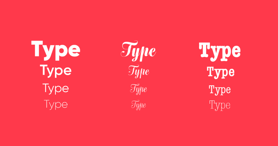
Typography
The typography you choose will speak a lot about your brand, so choose your fonts carefully. There are six basic font classifications: Serif; stands for classic, traditional, and trustworthy. Sans-serif; modern, clean, and help create a minimal design, perfect for a clean corporate look. Slab serif; bold, quirky, and confident. Script (Handwritten and Decorative) are informal and artistic.
Photography
One of the most important brand identity assets is photography. Starting from your product images to your advertising creatives you have to use photos. It’s important to identify clear guidelines about the types of images (and visual treatments) that are and aren’t appropriate. Establishing a consistent visual style right from the very beginning of your business is essential for your brand identity. This will make sure that all the images you use align with the voice of your company. You are going to use photography in every part of your online presence. Keep in mind to always be consistent, hire an expert, don’t over-edit your images, don’t overuse stock images, make an effort with professional photography and always write a good brief for your photographer.
Create a brand style guide
Once you’ve made your design assets, you need to make sure they’re used in the right way. Create a brand style guide which outlines your design assets, when and how to use them, as well as any design, do’s and dont’s for your brand. This will ensure that any future design is in line with your brand identity and generates the right perception with your audience. Remember that consistency is key to create a really strong brand identity. You have to align the look of all your social media channels with your website, packaging, and any additional design asset or promotional material.
Now that you know how to start building brand identity, it’s time to start designing. For more branding tips follow our Monday Learning lessons! If you don’t have the patience to deal with all this, feel free to contact us.